The Ultimate Guide To Color of 2022 - Very Peri
Feb 14, 2022 | Namami Sharma


 One of the most common threads of visual communication, which subconsciously affects our mood, compels us for action, and helps with the mental healing process is - COLOUR. Several ancient cultures have already acknowledged the importance of colour psychology, but it has recently drawn the attention of the general public.
EVERYTHING YOU NEED TO KNOW ABOUT
PANTONE 17-3938
Colour Psychology is used in every known field, from marketing to the world of cinema, for stronger persuasion.
Colour Psychology plays a crucial role in our life as every individual has their favourite colour, one that they are obsessed with and cherish the most, while some might only look for a specific shade or aesthetic that they feel describes them the best. However, no one can deny the beauty and appeal of a new trending colour.
As the announcement of Very Peri (PANTONE 17-3938), Colour of the Year 2022 by Pantone has been described as “a dynamic periwinkle blue hue with a vivifying violet-red undertone blends the faithfulness and constancy of blue with the energy and excitement of red” by per Leatrice Eisman, the Executive Director of Pantone Colour Institute.
THE STORY BEHIND VERY PERI
The Ideology behind the colour 2022 can be interpreted as the reflection of the global innovations and transformations in the field of technology. From cinematic aspects, the colour has been portrayed as a futuristic reference for technological advancements under certain non-fictional gems like Ex-Machina, Guardians of the Galaxy, Infinity War, Back to the Future, and so on, attracting the interest of Gen-Z and comforting the rest by comic nostalgia, making Very Peri as “not the colour we deserved but the colour we needed”.
Historically, every year, a colour from the Pantone archives has been selected to become the colour of the year.
Very Peri is the very first colour ever to be created, specially to fulfil this purpose. This shade results from almost a year’s worth of research and trend forecasting, with patterns picked-up from several realms like fashion and sports, focusing on the metaverse along the way.
Just as the name of the colour resonates with extremity, so does the feeling it reflects, which is the extent by how much the world needs to experience balance again. The colour strikes relevance to the spiritual realm as the amethyst crystal which offers a sense of calmness under turmoil.
Stimulating hope inside the clouded minds of feeble spirits all over the world, Very Peri is a sharp reminder of the Power Stone from Infinity Wars and Thanos’s failure, resulting in worldwide crises reflecting a similarity to our current circumstances. The shade also has roots in the world of nature like lilac from lavender, ensuring a warm, calm and comforting tone.
This new colour trend is synonymous with energy and joy, as well as brings a warm and happy atmosphere. Following the same note, Pantone named Very Peri as the happiest and warmest one out of all shades of blue.
The colour of the year 2022 is a very unique shade of purple that encourages creativity and imagination which gives us a fusion of a dynamic peri (winkle) blue and vivid violet-red undertones. Being the very first colour ever to be created from scratch for acknowledging the trend, it might get a bit tricky to create the exact shade in the beginning. In order to develop this shade, it is quite important to understand the depth of the colour.
The faithful and reliable blue blending with the vibrancy of red as an underlying tone added during the procedure are the key to creating an energising new hue known as Very Peri.

Image courtesy of Pantone
PAIRING WITH VERY PERI
Choosing a colour is a task made easier by Pantone when it launched Very Peri as the new colour of the year 2022. But, after the creation of the new colour comes the next step of pairing it with better options to create an eye-catching palette.
To create a successful collection, pairing the trending colour with an aesthetically appealing palette is a crucial step.
Although experimenting is the key to creating miracle palettes, here are some trusted, fun, and bold colours that would go with Very Peri:

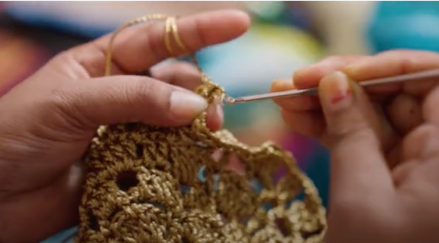
Image Courtesy of Rural Handmade
Pantone Pale Yellow, Peach, Metallic Silver, Off-White, Electric Blue, Bubble Gum, and Charcoal.
Very Peri in Interior Designing
Very Peri colour has an aesthetic that is suitable for futuristic designs in various aspects of life such as fashion, interior, design, and art. Very peri pops out as an eye-catching colour, offering great value for commercial interior projects.

HARRY NURIEV’S APARTMENT, CROSBY STUDIOS
BRINGING HOME ACCESSORIES
As the colour might get perceived as overwhelming and loud to some, using purple as the sole colour for the walls might not be the first choice of many interior designers to build their dream interior collection. But to create a trend-worthy collection, keeping up with the trends is a must. Doing so using home accessories in a subtle way would be beneficial to all the designers.

Image courtesy of Homeanddecor.com
Bringing in this latest trend (PANTONE 17-3938) through artwork and decorative home accessories is a great way to change the outlook and feel of the home without disrupting the existing overall aesthetics. Some trending accessories like vases and glassware accessories, closer to this shade of warmest purple, with fresh flowers or plants, will add life to the room whereas scented candles, light fixtures, and wall art in hues of Very Peri would aid in effortlessly redecorating the existing interiors. Very Peri can also be used as a solid colour or in the form of bold patterns on upholstery materials like velvet, cotton, linen, jacquard, and faux leather.
Introducing - Statement Furniture
Customization being one of the latest trends in itself, would seem like an efficient choice for many interior designers. As suggested by many forecasting industries, adding unique art pieces with functionality is something that would be quite appealing to consumers in the upcoming years.
Incorporating Very Peri into interior designing through customization would aid multinational brands in selling their collections successfully.

As the world stays at home for the most part during the pandemic, people would look forward to redecorating and adding a piece of unique statement furniture, which in turn would add a popping element to their homes. For creating a change and revamping the existing interior, injecting and experimenting with matte finishes would help in creating a soft look while adding a personalised touch. Last but not the least, including unusual hues such as Very Peri, would elevate perennial designs.
Mixing Soft Furnishing
Too much of one colour can easily become overwhelming, and for colours as bold as Very Peri, the execution must be done carefully. It can be a challenging task to avoid contradictory opinions while using this trend. Focusing on soft furnishing would divert emphasis to the boldness of the colour used in large proportions on walls and furniture. Using very peri in small proportions can balance the loudness of the colour with the overall aesthetics.

Image courtesy of Pantone
Very Peri in The Fashion Industry
Colour plays a key role in creating all kinds of collections, be it Home or Apparel. Very Peri has graced the house of the Apparel Industry by giving it a vibrant enthusiasm.
FASHION ACCESSORIES


Medium Doll leather tote, Bottega Venetta Bag, Medea
If this shade is too much on the eyes, pairing it with fashion accessories like a tiny handbag would single-handedly elevate the whole look of any outfit to above ordinary. Crushing big on this colour, fashion brands are eating out this colour whole with one-of-a-kind collections on the runways. As the colour offers a radiant effect, many influencers, fashion, and interior designers can be seen playing with this colour, be it small accessories or a plane wall providing a fresh look every time when used in an amicable manner.
Very Peri, A Unisex Hue
Note that Very Peri is a unisexual color and is perfect for decorating rooms for any gender. It is no secret that most of the famous collections that are trending today are inspired by the spectrum of LGBTQ. Being gender neutral is what the masses are looking forward to, making it symbolic of a progressive future for the world.
Conclusion
In conclusion, we hope this blog has helped you learn more about Pantone’s colour of the year, the history and fashion behind it.
We hope you enjoyed this blog! In the meantime, why not read this blog on 5 E-commerce Trends Of 2022?
Recommended