Reinventing Brands With Art, Science And Creativity
Aug 10, 2021 | Atharva Dahotre
 A summary of how building a brand is a cross over of all we know, but in one basket.
What is a brand?
"Just do it," "I'm lovin' it," "It gives you wings," "Finger lickin' good," "Open happiness."
I can bet that when these ran through your mind, you must have gotten a glimpse of what these words were associated with. A flash of red and yellow, maybe the opening of a carbonated drink or a jolt of energy seeing a blue and red tin.
Thats the power of a brand.
In a very simple definition (and quoted by Wikipedia), "A brand is a name, term, design, symbol or any other feature that identifies one seller's goods or service as distinct from those of other sellers."
Well, yes, that makes complete sense in a very simple way for understanding. But a brand goes beyond just a feature or a symbol, or a design. A brand attaches itself to you and not the other way around because it appeals to you emotionally. Of course, quality matters, but it is the message which sticks around. You can get an amazing burger anywhere in the world if you visit the local eateries, but how often have you found yourself wandering around until you spot a big yellow glowing "M" on the roadside and let out a sigh of relief? I can (again) bet a lot of times.
You are hooked on the brand's emotional appeal. And trust me. It takes a lot of time and effort to create a "brand." We like to associate class and a way of living with these so called brands because they appeal to many people, you suddenly find yourself in the community of people with the same liking, therefore, strengthening your bond with it. It is an interesting sight to see how people will blindly trust a well-established brand and even forgive some of the “mistakes” that occur on the way.
Brand elements
A brand comes into existence when you mix in identity in the form of colors, typography, and a set of guidelines that define how it will be perceived. Still, the fundamental elements which make up the whole system are the target audience, brand promise, brand perception, brand values, voice, and positioning.
As I mentioned earlier, it is all about emotional appeal. Now we dive into the world of an even more amazing phenomenon and how to make up the final element.
Illustrations.
Element of creativity
Before we head on to the actual illustration section, we must first understand a critical piece of information that fuels the very world of design and problem-solving.
Creativity.
Creativity has been hailed as the harbinger of new things, ideas, innovations, ways of thinking, and much more. Creativity has had a lot of definitions and expressions of meaning. Some might even say it is an ability of sorts! Some might say it is a way of thinking. In retrospect, when we look closely, we can see a definitive pattern. It is not thought more than it is an ability, for it is a process of thoughts which over time becomes an ability.
Quite simply breaking it down to its fundamentals, creativity is observing situations, things, and everything around you and reorganizing that information and data in problem-solving in a fundamentally different manner. It is observing things from a different perspective. Connecting situations of different occasions into one unique and divergent output.
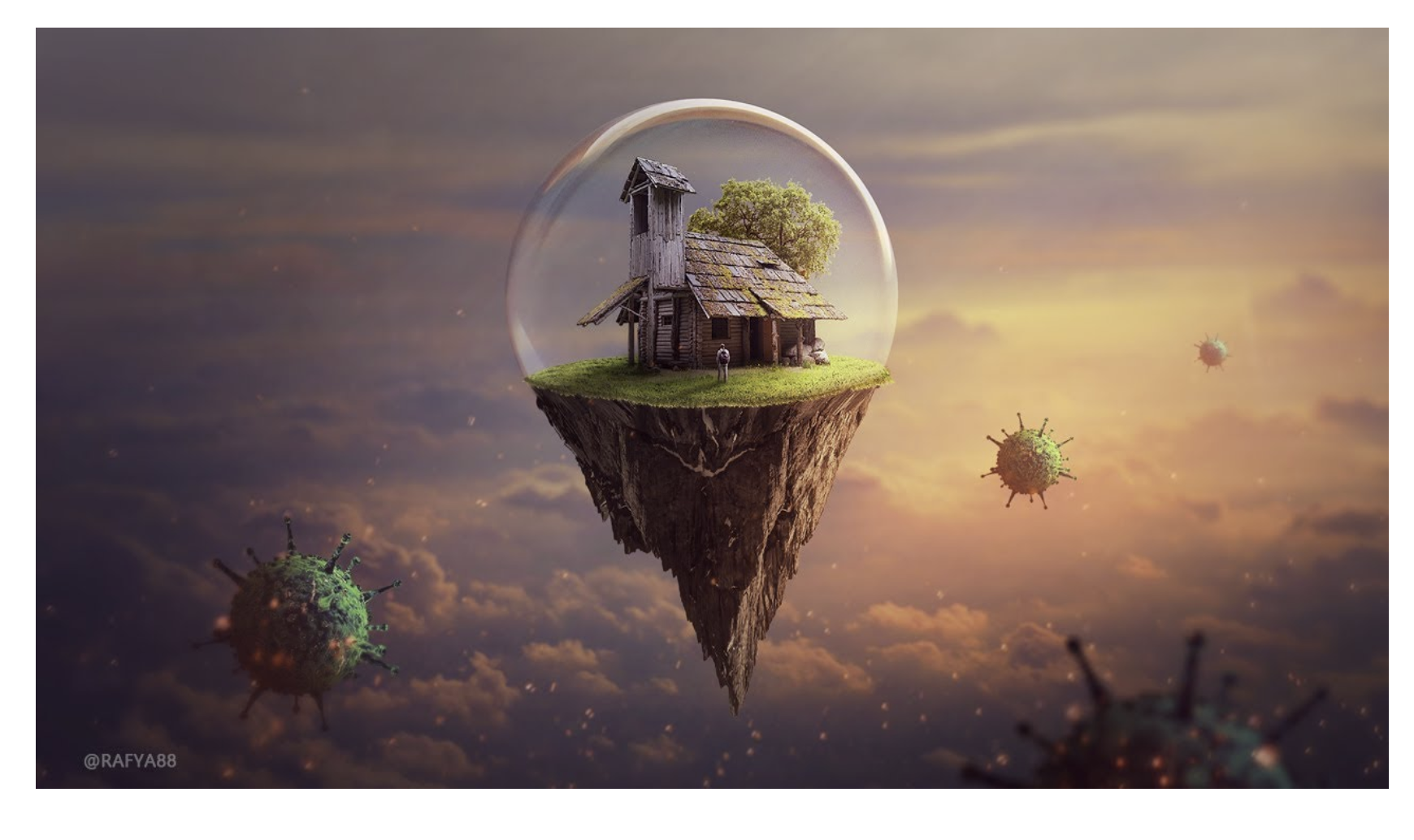
This is a classic example of creativity. A message so subtly bequeathed to the reader. A house in a bubble far from the actual world shrouded in some virus (let's take Covid). Now obviously, this wouldn't exist in reality, but that's the point of creativity! It exists in a whole different realm. A realm where there are no set boundaries or regulations or restrictions of any kind. A realm that is governed by the subconscious.
That is why it is said that children below the age of 10 are the most creative beings on the planet. Their imagination is not limited to the ground possibilities of what is doable or what isn't. For them, the sky's not the limit. And that exact kind of mindset is required in designing illustrations or an entire illustration system. Creativity is a must because that is the only thing that will capture the reader's eye. Creativity makes an idea novel, varied and different. It is and has been used as an asset in the design and marketing industries from times unknown.
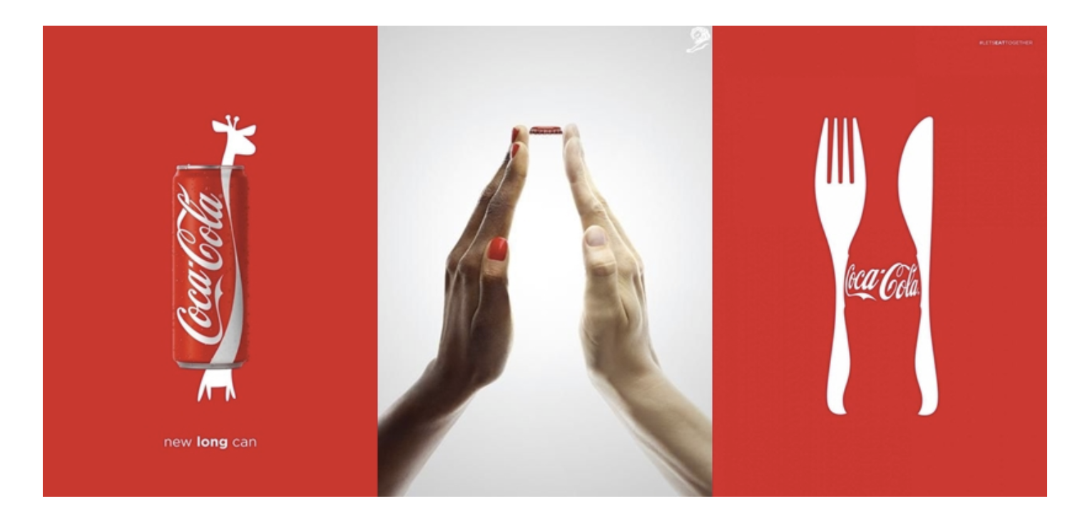
You can see this clever and eye-catching ad from Coca Cola for example. The first image depicts a giraffe hidden amongst the can, which signifies the “bigger can” upgrade. The second image can project an image of the bottle without even you having to think about it and the diversity of people. A literal example of two birds with one stone. Excellent use of negative space, which still makes sense to the viewer.
That is how brands have been using the power of creativity to connect people with the brand emotionally, mentally, and physically.
So now we finally arrive at the nexus of this blog.
What is an illustration?
Combine art, science, creativity with a pinch of context and you’ve got yourself an amazing illustration. Illustrations are one of the unspoken elements of a brand. They have recently made an explosive entry into the industry by featuring in all of the major service providers’ websites and applications. We know illustrations as “drawings” or “art” but they are much much more than that. A good illustration can convey an entire message which may take up a whole page of textual information. More importantly illustrations are a great way to convey a story or emotions.
Illustrations and illustration systems have been conceptualised by major brands in the wake of digitalisation for the modern generation whose attention span is that of 8 seconds. That’s right. 8 seconds!
The average millennial user is going to stay on your website for 8 seconds to try and understand what you’re providing and if you’re worthy of being the provider for the same. This gap in the provider and today’s user has grown wider in recent times and services like Google and Airbnb are already steps ahead of their competition to bridge that gap. They have decoded the science of convincing the user why they should stick with them.
And yes you guessed it right. They are illustration systems.
Different styles and examples
Illustrations have long been considered as just art. In any case that is true but when you mix art with services you create something truly unique. You create an experience. So let’s say for example, you see this kind of illustration while you’re visiting Airbnb for the first time.

An example of Airbnb’s illustration system | source: Airbnb
You can grasp a lot of information through this one simple cover image. You can see a solo traveler and a family indicating that it serves various audiences without any bias. It depicts international travel and even the various locations where you can stay! Be it in the mountains or by a riverside, and you can pick your favourite.
Promise, perception, values, promise, and positioning. All the brand elements are conveyed cleverly by one simple illustration. One more awesome example would be uber eats.
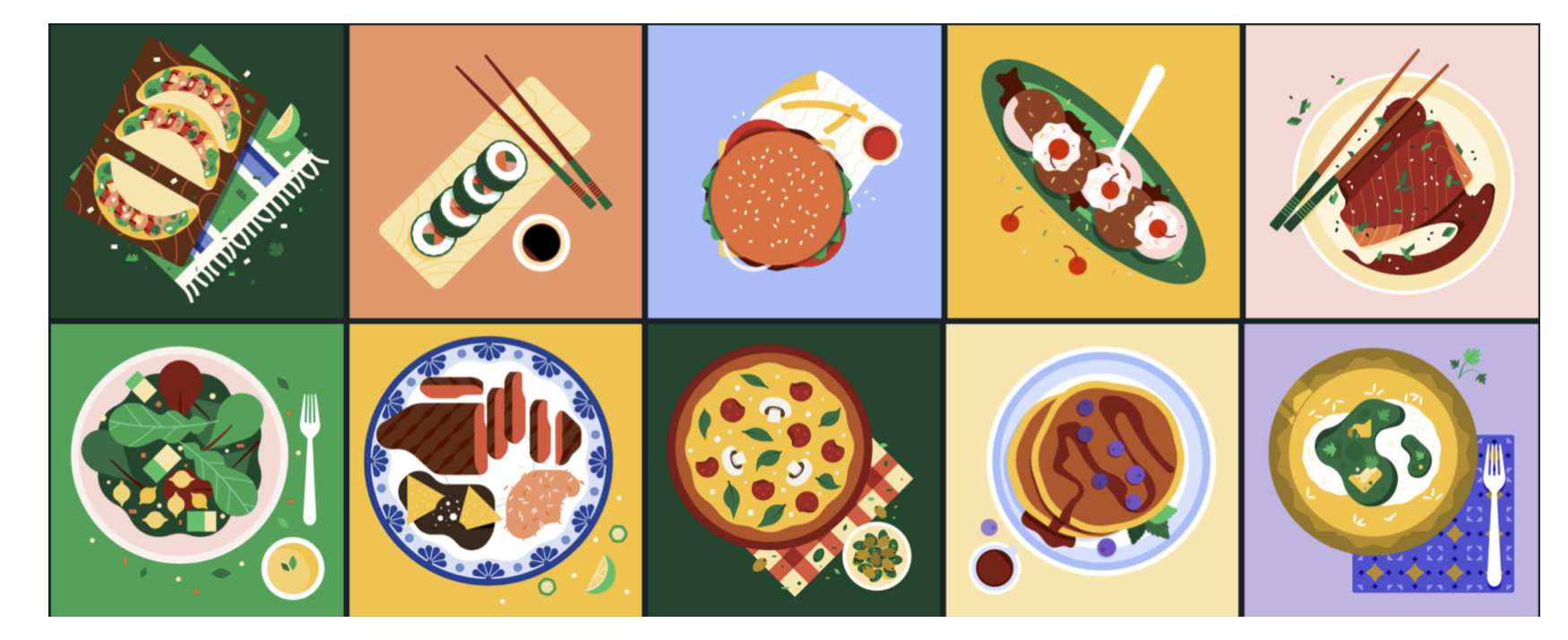
UberEats illustration system, | source: Behance
This illustration system does look appealing. Little do you know; there is a lot of science going on here. The colours are number one, adding a flair and atmosphere to the whole page, but then did you notice the positioning of each dish and the contents inside it? It’s diagonal, creating a dominant direction for the composition, whereas the food and the condiments have a second effect by keeping them as the focal point of interest.

Illustration system of Slack. The overall theme was to be represented as “Slack-y”.
Slack has established itself as a market leader in office communication tools. One key factor in getting people to register with them was the illustration system which entices the viewer with an overall idea of how cheerful, bright and easy-going this piece of software would be. Slack’s illustration system plays on the emotional aspect of the average viewer, and it does so with tact.
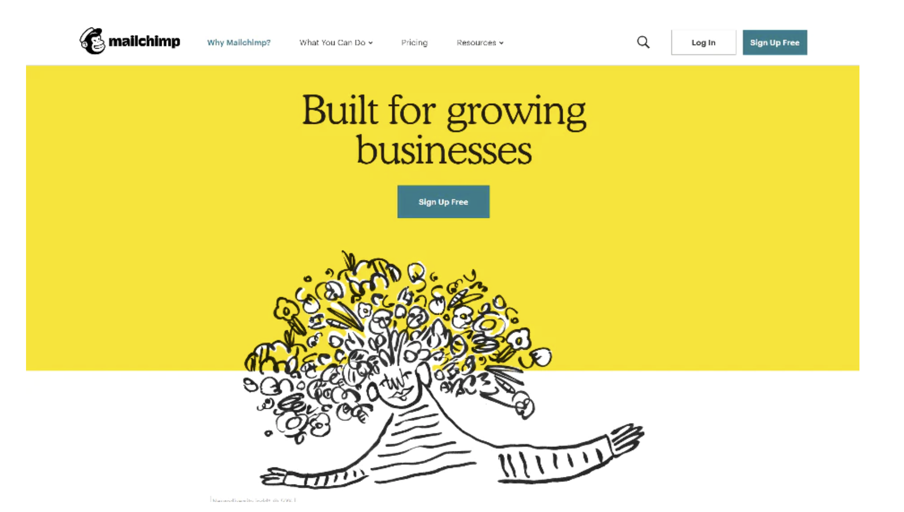
This illustration system is from MailChimp
Mailchimp is a marketing automation software and email marketing service. The loud, vibrant, and quirky feel is bound to capture your attention. If you look at this with a subconscious understanding, you might notice how it represents a sort of fast-paced doodle, which symbolically demonstrates the service’s quick and easy-to-use service. They carry this illustration system to other platforms like Linkedin, Instagram, and their strategically placed ads, too, so you don’t have a mismatch between any platform. The message can be spread consistently.

Headspace’s illustration system
Headspace is a meditation and calm application/service whose illustration system initially may seem a bit childish. Still, closer inspection conveys the exact idea of what it provides you as the user. Maybe after using the service, you may feel exactly like these blobs of character! Playful, relaxed, and energetic. Even though the target audience may be grown-ups, this system truly creates a feeling of happiness when looked at. Just like when we were children!
_Illustration_System-209.png)
Casper (a mattress brand) illustration system
Casper stands out amongst its competitors for one reason and one reason only. Their way of portraying their product on their website. A headline and the corresponding illustration. So creative and frugal and yet impactful! Figuratively speaking, it tells you how sleeping on their mattresses feels like sleeping in the clouds, which actually might be the dream of so many people, effectively sealing the deal!
That right there is a blend of creativity, science, and art. And it creates some interesting things.
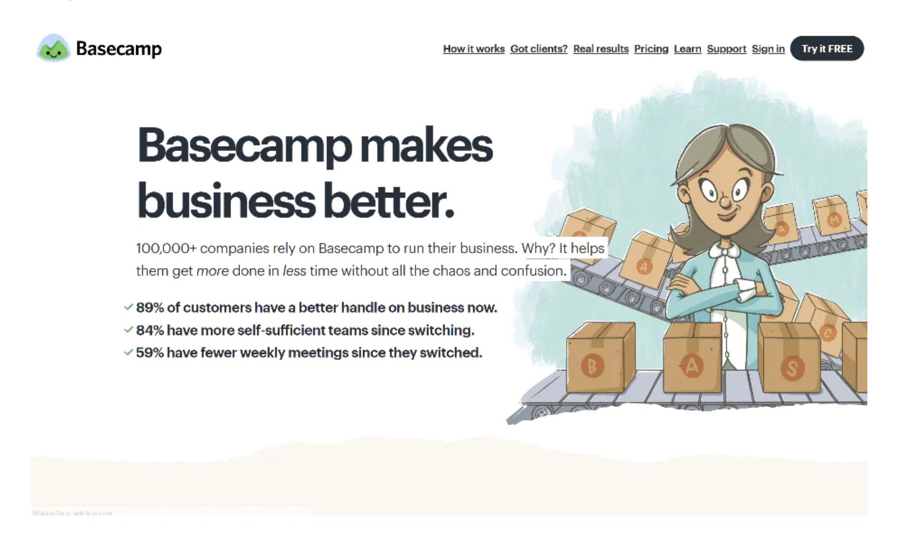
Basecamp and their unique take on presentation
Basecamp is breaking the bubble of flat illustrations and instead presenting its service as more accessible and personalized. With a refreshing change of pace, customers are attracted to the "unique" product in the market instead. What's more, is that they have translated this kind of unique illustration to their support members' portraits making it truly unique and engaging.
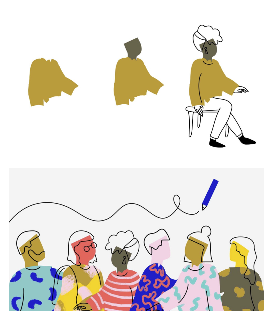
Idean’s illustration system and its formation
Idean is a Capgemini company that specializes in design solutions. Their simple and distinctive language starts with one simple brush stroke, which evolves into a gradual illustration. The look might seem a bit unclear or even incomplete, and that reflects their motto, “Fearlessly human.” Another great example of how simplicity is a virtuous trait is if used creatively.
Illustrations in service/web/product
Brands have reinvented themselves for the 21st century. They are becoming more design-led. Catering to their audience in an even more organic way of data consumption is becoming more and more significant.
Different services use different styles of illustrations. Some might depict flowy, happy, more colorful kinds of illustrations reflecting their brand personality. In contrast, some other brands might keep it more toned down and monochromatic to depict the service's seriousness.
You won’t ever see an event management service website riddled with monochromatic and simple illustrations more than a funeral conducting service website with bright visuals and a bunch of cheerful people barbequing on their front lawn. Illustrations have to fit in the context of what you’re offering. And for that thing alone, graphic designing as a profession has also increased in both demand and supply. Traditional artists are striding over to digital canvases and making an actual living on illustrating alone.
CONCLUSION
All in all, a brand should have a good illustration system for consistency, context, information, and narrative. Take your brand to the next level by providing your user with illustrative information rather than textual one and see the magic happen!
Want to know more about building a sustainable brand, then check out this blog!
Alternatively, contact us to know more about what we do!
Recommended
