How To Improve Charity User Experience
Dec 13, 2021 | Hayat Ali
 Charity is the practice of benevolent giving. Charity organizations are non-profitable and they heavily rely on the generosity of the public to help by donating money, goods, time and shopping with them. It is very important for them to get a consistent fund and donation for them to survive. In order to survive, becoming more and more apparent and reachable is the way to grow their presence. By having a website they can expand their visibility and brand.
Here are some on the advantage of website for charity:
Raise Awareness - to communicate to your target audiences about what you do and why you do and what are you trying to achieve.
Encouraging donation and sign ups
Promote volunteering and recruit staff
Sale your goods through your website
Maintaining relationships with supporters
In this digital age there are of course so many charity websites, but it doesn't mean every charity has a good website. What distinguishes a good and bad website is the user experience of the websites. User experience refers to the quality of experience a person has when interacting with a specific product. In this case your charity website. The design team uses the user experience design process to create products that provide meaningful and relevant experience to users (interaction design, 20210). The quality experience is measured by how easy to use your website, accessibility, useful, usable, findable, credible, desirable, and valuable.
So how to improve your website user experience
When creating or making improvements on your website, allway make sure that your design decisions or changes are backed up by the user research. To make your research and design user- centred, follow the Stanford design thinking process diagram showing below.
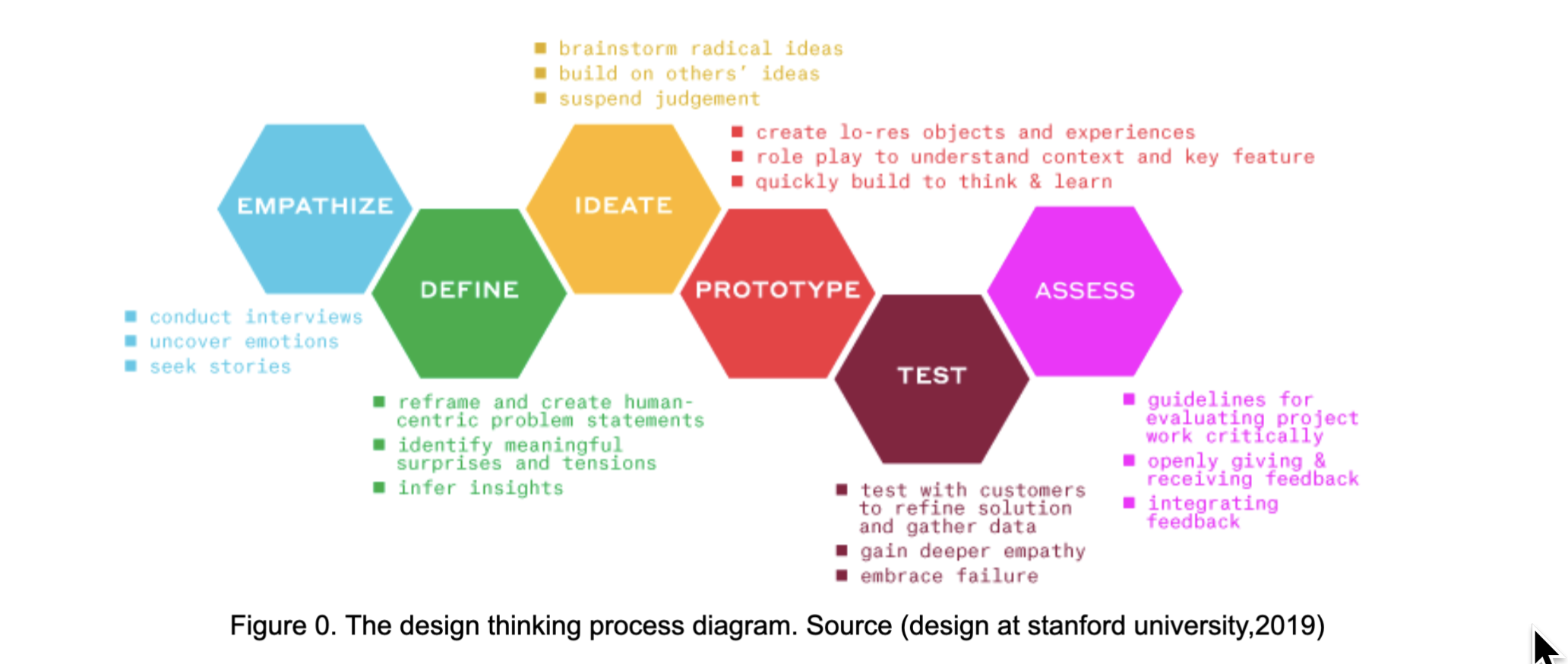
Understand and empathise your target users. Listen to what they say about your website. This can be achieved by conducting user research such as interviews, surveys, and online questionnaires feedback form.
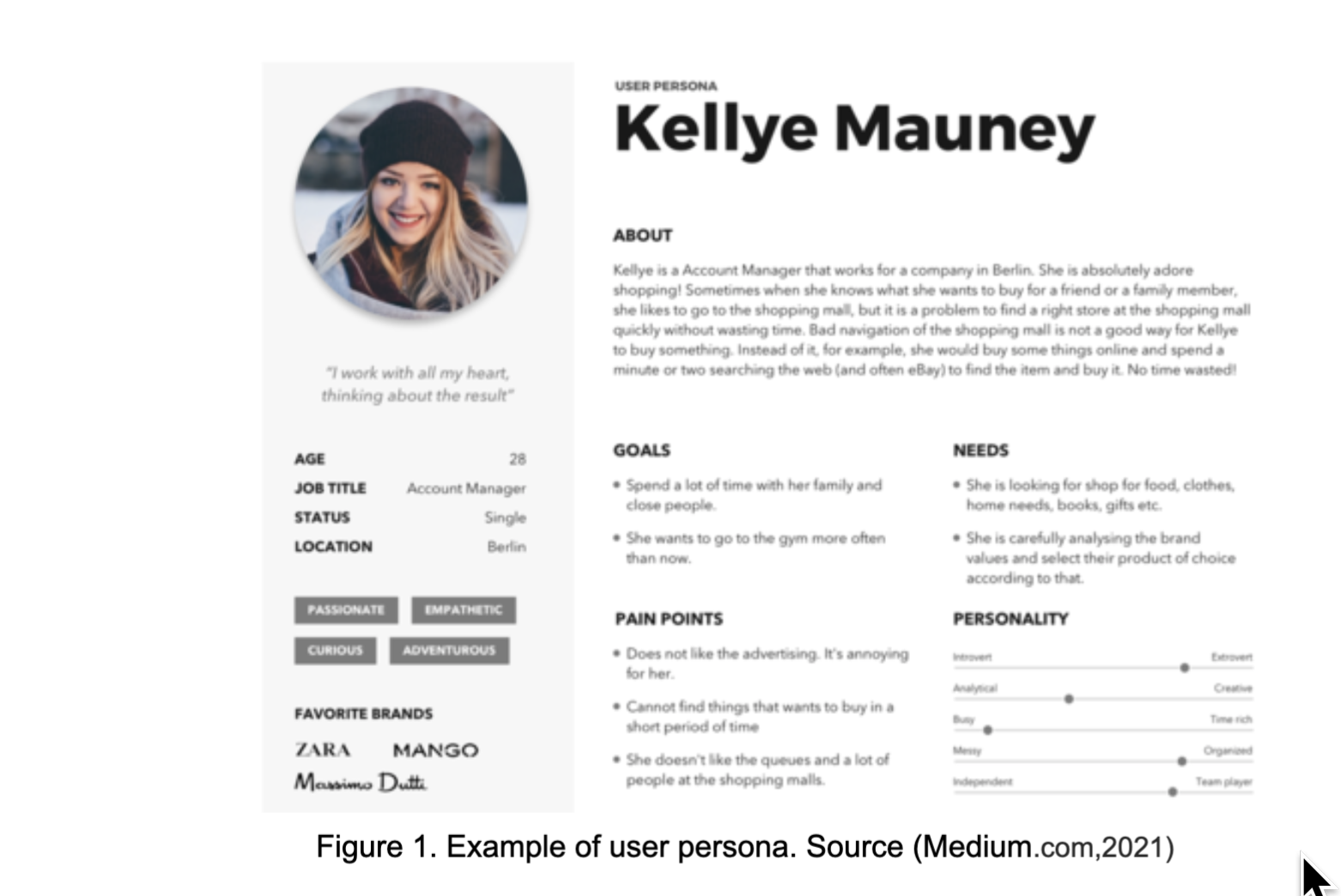
Identify your user personal based on your user research. The development of Personals is a useful tool to create and identify reliable and realistic representation of your target users segment for reference (usability.gov, 2021). This means all the people involved in the design process for your website can get to know the user better and they can make decisions based on the personas.
Understand and visualize the process users go through to accomplish a goal. This can allow the designer to understand the interaction between the user and the product from the user's point of view .
Based on the user research improve, the entire website. Most importantly, improve your landing page. This can help ensure that visitors stay on your website.
Test and compare your improved version of the website with the user. This can be achieved by conducting UX benchmarking. There are so many different methods that you can test your website with users such as usability test, A/B testing
Ensure your website is accessible and inclusive to everyone. For instance your website should be assacceable for people with disability or visual impairment. This can be achieved by following the home office accessible guideline.
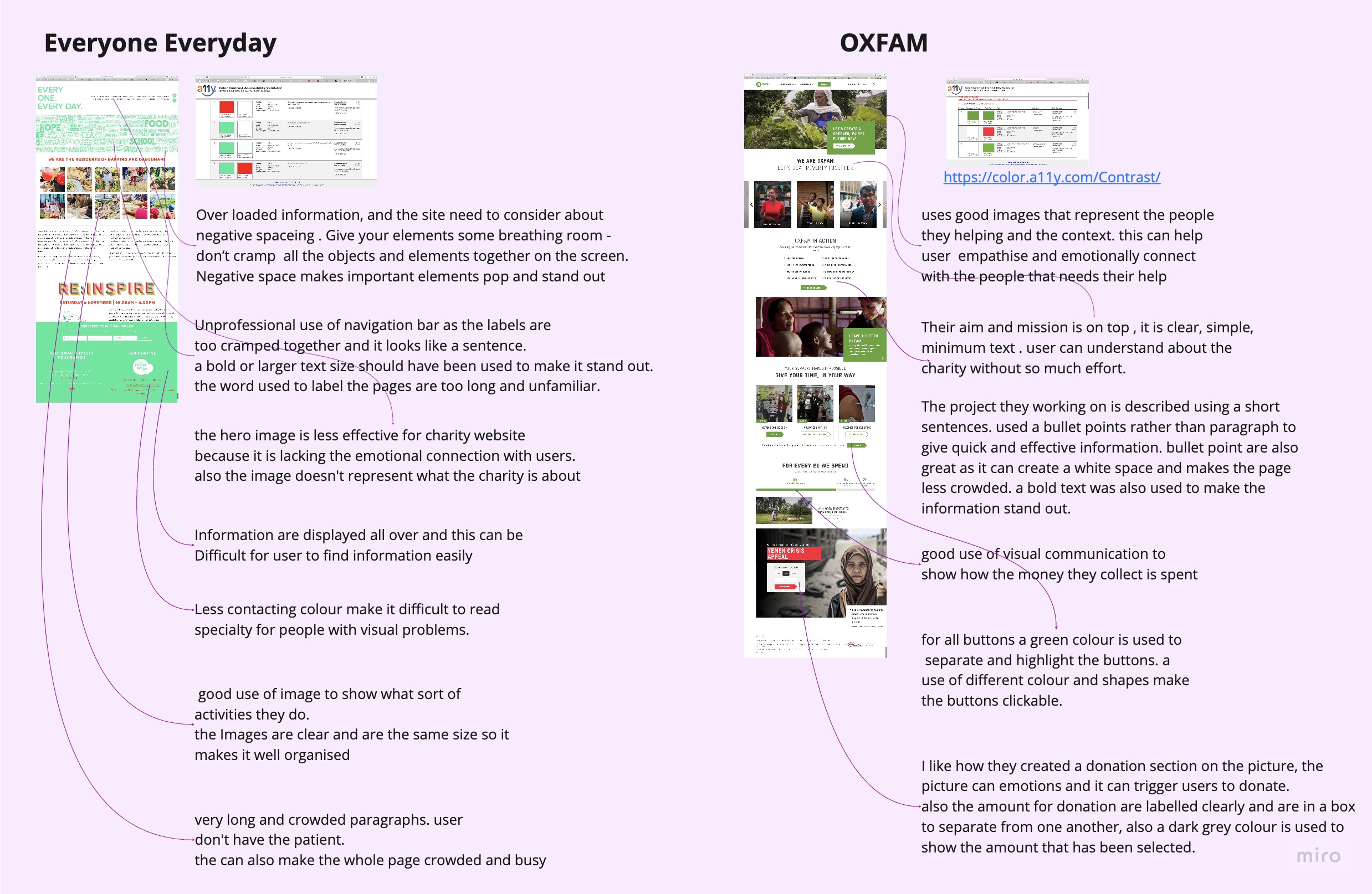
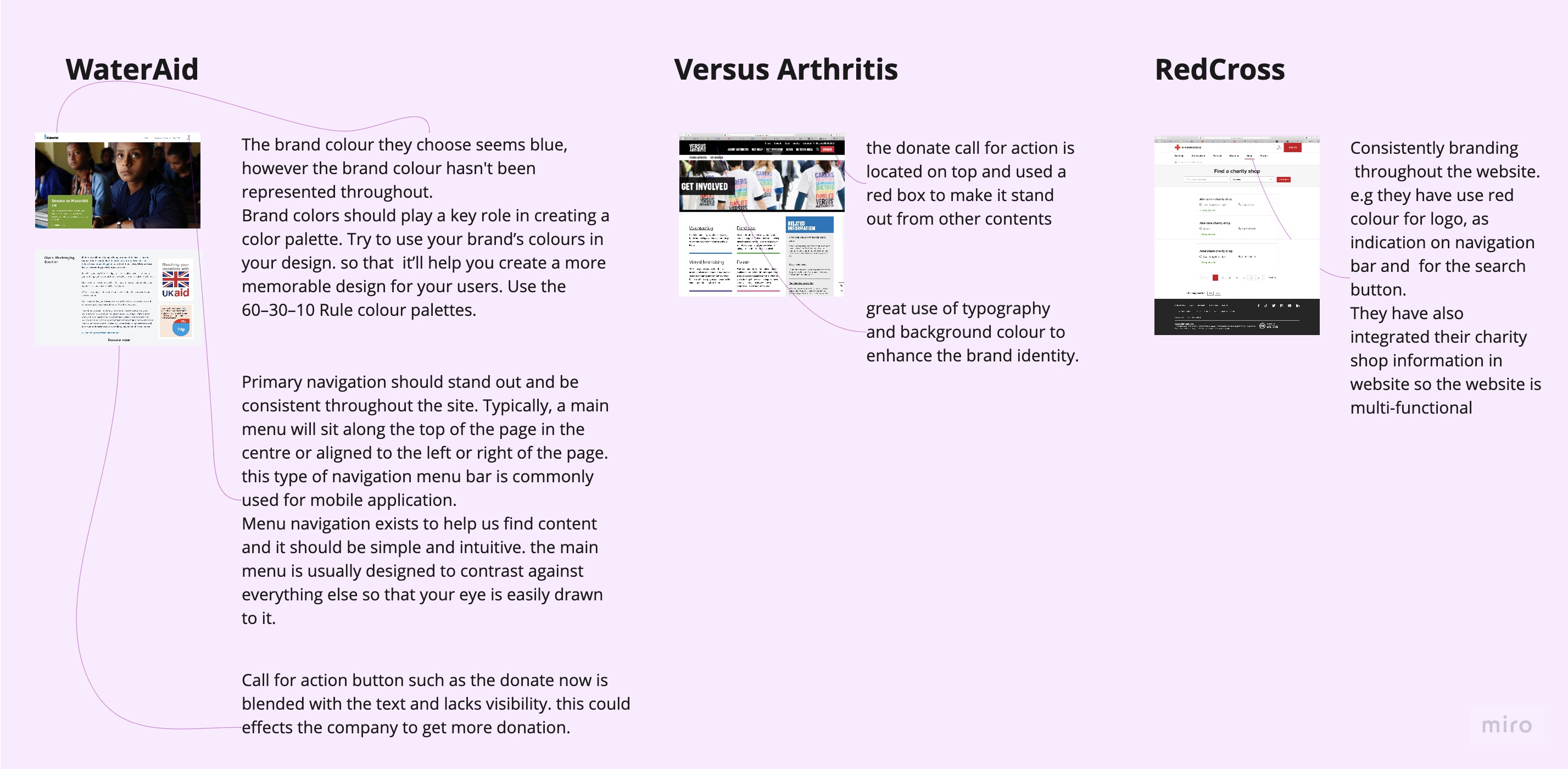
Here are some comparatives between a good and bad user experience for charity websites.
Recommended
