Ecommerce User Experience
Dec 21, 2021 | Hayat Ali


 Times have changed and so have the ways of shopping. Most retailers are urgently moving or have already moved to eCommerce. But the customers always remain the same.
 eCommerce User Experience: How to Improve the UX of Your Online Store
Times have changed and so have the ways of shopping. Most retailers are urgently moving or have already moved to eCommerce. But the customers always remain the same.
Every customer wants a seamless shopping experience, especially in an online store. In fact, that is the promise of online shopping, to provide a fast and convenient shopping experience.As an eCommerce website owner, your primary objective is to make the shopping process as smooth as you can, for the end-user. And this all comes down to the user experience of your online store.
Here are some of the user experience guidelines to improve your online store.
1. Listen to Your Customer
The most essential and the very first step to improving your UX is to listen to the users that interact with your online store. The opinions of the end-user matter the most. They can give you better insights than the people that manage your website.
Read both negative and positive reviews, resolve your customer’s query, and reply with a solution to their complaints. You can use feedback forms to better understand your customers’ experience of your website.
When you actively ask for feedback, it makes your customers feel as if their opinions are valued by you. Customers will give you much of the useful insights that you need in order to improve user experience. So, kindly listen to your customers.

2. Provide a simplified primary navigation
To make your website user-friendly and intuitive, primary navigation is key and very important. An organized and well designed navigation allows users to find products they are looking for easily and effortlessly. Also it provides clear guidance on how users can get from point A to point B in the least frustrating way. A well designed navigation should be simple, consistent, clearly labeled and signposted so that users understand where they are.
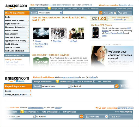
The old version Amazon used to use a left side primary navigation for the category list as it shows in picture below.
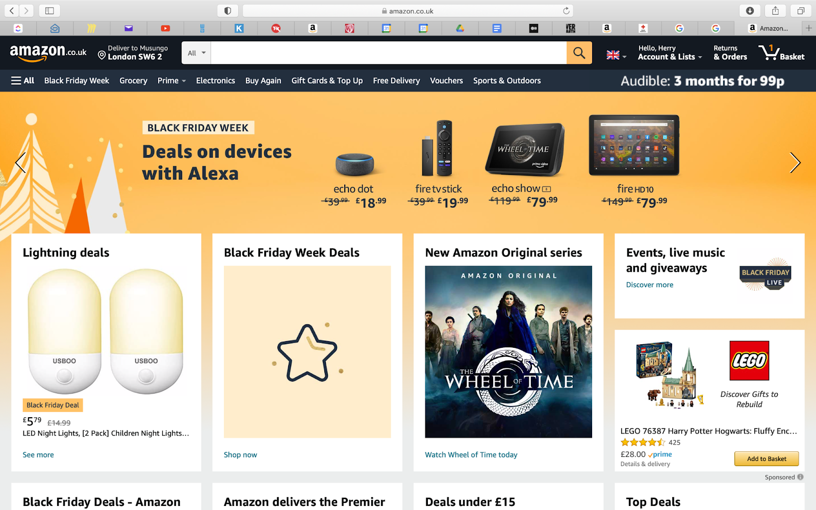
Today, Amazon uses top primary navigation as it is simple and easy to identify and use by users.
3. Make the checkout process and payment faster
The checkout and payment process are the most important features of a website. After all, it is the checkout process that leads to an increase in conversion and sale. Here are some tips to make the checkout process easier for your customers:
Provide reassurances on security and privacy. Design the website professionally to increase its credibility.
Stop sending them to other websites to pay.
Offer a guest checkout, users might not have the time or the interest to register.
Do not force people to sign up
Provide variety payment options on the checkout page
Add a clear call to action
4. Consider minimalistic design
When it comes to website design , it is very important to be as simple and straightforward as possible because a complex website with so many features can create a negative effect on the user.
Recommended